How to spot a misleading graph - Lea Gaslowitz
3,026,977 Views
87,398 Questions Answered
TEDEd Animation
Let’s Begin…
When they’re used well, graphs can help us intuitively grasp complex data. But as visual software has enabled more usage of graphs throughout all media, it has also made them easier to use in a careless or dishonest way — and as it turns out, there are plenty of ways graphs can mislead and outright manipulate. Lea Gaslowitz shares some things to look out for.
Additional Resources for you to Explore
Now that you have watched the video, take what you have learned and analyze the graphs below. (At the end of this section are some possible solutions)
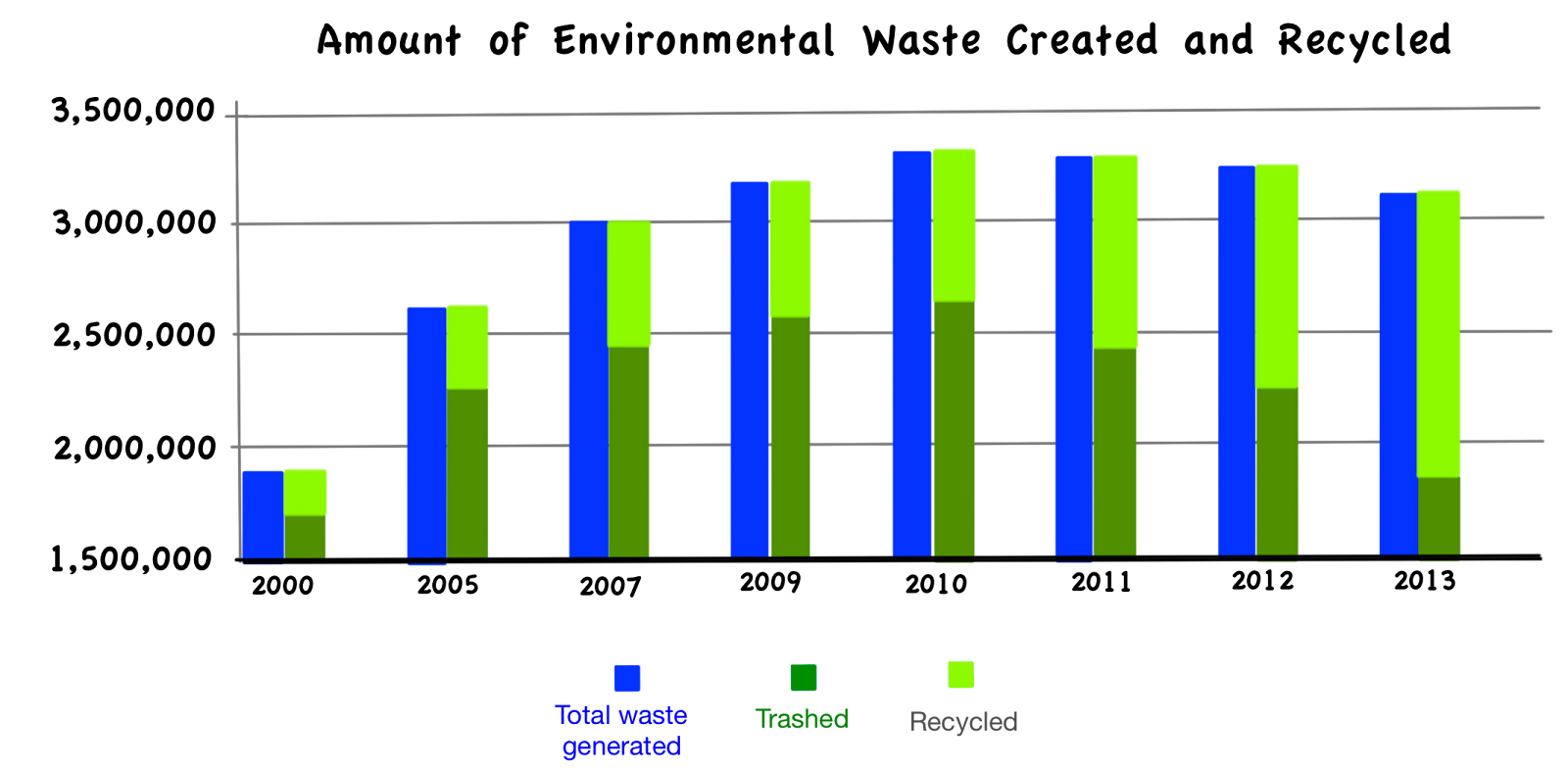
1a. Explain at least three problems with this graph.
1b. In what year was the amount of waste trashed closest to the amount recycled?
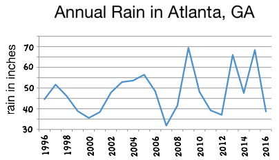
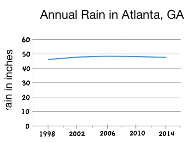
2a. The two graphs above show very different pictures of the rainfall in Atlanta. Explain how each graph is distorted.
2b. What information might help you decide if the variance in amount of rain in Atlanta is unusual?
3. LeBron James has been playing basketball for the last 14 years. The table below lists his average points per game for each season.
03/
04
04/
05
05/
06
06/
07
07/
08
08/
09
09/
10
10/
11
11/
12
12/
13
13/
14
14/
15
15/
16
16/
17
20.9
27.2
31.4
27.3
30.0
28.4
29.7
26.8
27.1
26.8
27.1
25.3
25.3
26.4
a. How could you distort this data to emphasize the worst of his performance?
b. How could you distort this data to emphasize the best of his performance? What other information might help you make this point?
All graphs should be looked at carefully and not just taken at face value. Distortion of the horizontal and vertical axis is just one of the many ways graphs can be misleading. When trying to make a point, people sometimes cherry pick data that supports their points, graph two totally different types of data measured in different units on the same graph, or ignore other variables that would explain the results. Even when someone is not trying to mislead you, his or her graph can be misleading by accident. Three-dimensional and picture graphs look nice, but often distort our perception of the data.
To learn more about other types of misleading graphs check out Misleading Graphs at FrontPorchMath.com. There you will find other examples along with an activity to help you practice finding problems in different graphs.
Possible solutions for the questions above:
1a. The y-axis does not start at zero.
There is no scale on the y- axis.
The x-axis skips years.
The data may have been “cheery picked.”
By starting at 1,500,000 tons of waste it makes it hard to tell the relationship between the amounts of waste recycled verses going into landfills.
Putting the recycling information on top of the trashed material makes the graph harder to read.
1b. In 2013 the amount of waste trashed was approximately 1.9 million tons and the amount recycled about 1.3 million tons. Or about 40% of the total waste was recycled. (In 2000 it was about 10%, 2007 about 18%, 2011 about 26% recycled.)
2a. Graph on the left: The graph does not start at zero.
Graph on the right: The data was cherry picked. It only plotted one data point for every 4 years, when the inches of rain were most consistent.
2b. It might be helpful to know if other cities experience this much variation from year to year.
3a. Ways to emphasize the worst of LeBron James's performance may include expanding the vertical axis by using increments of 0.2 or 0.5, starting the scale at 20 or 25 points, and/or skipping his first season.
3b. Ways to emphasize the best of LeBron James's performance may include starting the vertical axis at zero, and using an increment of 2 points on the y-axis. If might be helpful to know what the average number of points per game is for other players.
Sources:
1. The graph on waste was adapted from http://www.electronicstakeback.com/designed-for-the-dump/e-waste-in-landfills/.
2. Rainfall data came from http://www.weather.gov/ffc/rainfall_scorecard.
3. Data about LeBron James comes from http://www.basketball-reference.com/players/j/jamesle01.html.
1a. Explain at least three problems with this graph.
1b. In what year was the amount of waste trashed closest to the amount recycled?
2a. The two graphs above show very different pictures of the rainfall in Atlanta. Explain how each graph is distorted.
2b. What information might help you decide if the variance in amount of rain in Atlanta is unusual?
3. LeBron James has been playing basketball for the last 14 years. The table below lists his average points per game for each season.
03/
04
04/
05
05/
06
06/
07
07/
08
08/
09
09/
10
10/
11
11/
12
12/
13
13/
14
14/
15
15/
16
16/
17
20.9
27.2
31.4
27.3
30.0
28.4
29.7
26.8
27.1
26.8
27.1
25.3
25.3
26.4
a. How could you distort this data to emphasize the worst of his performance?
b. How could you distort this data to emphasize the best of his performance? What other information might help you make this point?
All graphs should be looked at carefully and not just taken at face value. Distortion of the horizontal and vertical axis is just one of the many ways graphs can be misleading. When trying to make a point, people sometimes cherry pick data that supports their points, graph two totally different types of data measured in different units on the same graph, or ignore other variables that would explain the results. Even when someone is not trying to mislead you, his or her graph can be misleading by accident. Three-dimensional and picture graphs look nice, but often distort our perception of the data.
To learn more about other types of misleading graphs check out Misleading Graphs at FrontPorchMath.com. There you will find other examples along with an activity to help you practice finding problems in different graphs.
Possible solutions for the questions above:
1a. The y-axis does not start at zero.
There is no scale on the y- axis.
The x-axis skips years.
The data may have been “cheery picked.”
By starting at 1,500,000 tons of waste it makes it hard to tell the relationship between the amounts of waste recycled verses going into landfills.
Putting the recycling information on top of the trashed material makes the graph harder to read.
1b. In 2013 the amount of waste trashed was approximately 1.9 million tons and the amount recycled about 1.3 million tons. Or about 40% of the total waste was recycled. (In 2000 it was about 10%, 2007 about 18%, 2011 about 26% recycled.)
2a. Graph on the left: The graph does not start at zero.
Graph on the right: The data was cherry picked. It only plotted one data point for every 4 years, when the inches of rain were most consistent.
2b. It might be helpful to know if other cities experience this much variation from year to year.
3a. Ways to emphasize the worst of LeBron James's performance may include expanding the vertical axis by using increments of 0.2 or 0.5, starting the scale at 20 or 25 points, and/or skipping his first season.
3b. Ways to emphasize the best of LeBron James's performance may include starting the vertical axis at zero, and using an increment of 2 points on the y-axis. If might be helpful to know what the average number of points per game is for other players.
Sources:
1. The graph on waste was adapted from http://www.electronicstakeback.com/designed-for-the-dump/e-waste-in-landfills/.
2. Rainfall data came from http://www.weather.gov/ffc/rainfall_scorecard.
3. Data about LeBron James comes from http://www.basketball-reference.com/players/j/jamesle01.html.
About TED-Ed Animations
TED-Ed Animations feature the words and ideas of educators brought to life by professional animators. Are you an educator or animator interested in creating a TED-Ed Animation? Nominate yourself here »
Meet The Creators
- Educator Lea Gaslowitz
- Director Mark Phillips
- Script Editor Alex Gendler
- Sound Designer Sam Bair
- Associate Producer Jessica Ruby
- Content Producer Gerta Xhelo
- Editorial Producer Alex Rosenthal
- Narrator Pen-Pen Chen